I was editing the pictures from Anne-Claire and Farbod's wedding and I started playing around with Lightroom library filters when it hit me. I can do stats again! And pretty infographics! Pre-emptive FAQ: Why did you do this? Before wedding photography I was in grad school in biology. I loved fieldwork, numbers and pretty graphs. Wedding photography statistics combines Alex's ghost of science past and Alex now.
How did you get this data? I got these data from my most recent wedding, from both me and my second photographer. The number of images represent the number of shots that made it into the final selection of images, not the original number of shots. I used the Lightroom library filters to get the numbers and then to make the graphs I just used Excel (sorry R) and a tiny bit of Photoshop to make it prettier. Now I just want to add a disclaimer. Weddings are not all the same, and I'm sure if I did this for every wedding I shot the stats would be widely different.
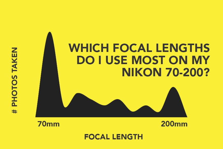
Let's start by seeing which focal lengths were the most used by our zoom lenses.


Interesting that both our peaks are at the limits of our lenses. And the only focal length where we overlap, 70mm, is heavily used. Now let's see the number of pictures vs. time of day. Keep in mind again that these are the shots that made it into the final selection, not the number of shots taken during that time:

It starts off slow with the morning preparations and peaks around ceremony time. The first dip at 15:00 was when we were in the car, the second one at 19:00 was when we were setting up before the reception. We weren't slacking off! Now hover over it with your mouse to see how often flash was used vs. natural light. Again, every wedding is different, and I don't think there's usually this clear of a cut between flash and no flash. We just had amazing light during the morning, we don't want to use flash in churches, and then the reception hall was generally dark so we had to light all shots. You can refer back to my blog post about the wedding to look at the shots!

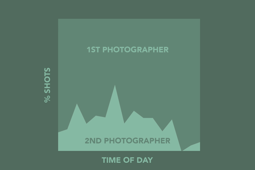
This is also pretty interesting. The % of shots by me and my second photographer. This, by the way, is right where I'd want the % to be. There are moments where the percentage is closer to 50-50, when we split up for example. At times the ratio is more skewed because I ask my second photographers to let me take the lead, to not overcrowd our bride & groom with cameras. And then during the reception dancing shots, the second photographer helps me with my off-camera flashes, which are set up only for my camera. So it's normal that there's the big dip there.

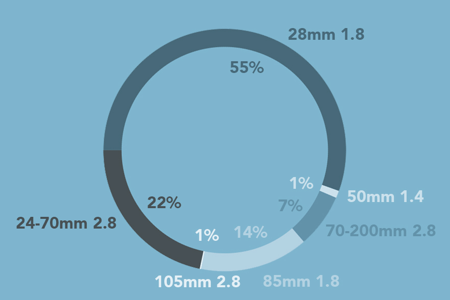
Finally let's look at the lens use distribution. This is a doughnut chart, slightly less tasty than a pie chart. This is the graph that surprised me the most. I usually shoot way more with the 50mm 1.4, and not as much with the 28mm 1.8. Pretty interesting. Also note the little 105mm 2.8. That's my macro lens, which I bring just for one shot: wedding rings!
Is this information useful in any way? Not really. This is just my idea of fun. But it could be useful actually. Let's see:
Visualizing the ratio of shots from the first vs. second photographer according to the different parts of the wedding day can reveal our strengths. I could also measure the % of shots that made it into the final selection vs. number of original shots taken. As a photographer you want to be deliberate and intentional in the shots you take, and many, when starting out, use the "spray and pray" method, which results in a very low percentage of usable shots. Now if you measure this %, you have a baseline number from which you can compare future performances. Other things include looking at your most common focal lengths, which could inform a purchase decision, or seeing when during the wedding day we're most likely going to need to change memory cards.
Bro you call these stats? Hey this is my blog no one’s looking at p-values here.
Thanks for reading! And hey if you want to read more tips, sign up to my newsletter Postcards from Alex!

